
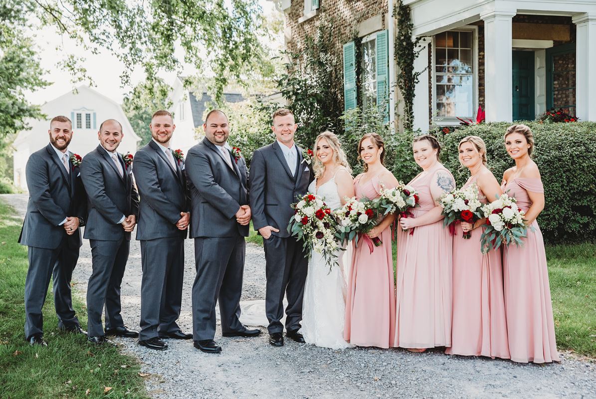
A wedding gallery from 2019 is easy to date. Faded blacks, teal shadows, skin pushed slightly orange, a warm haze over everything. It looked current then. It looks like a specific year now.
Photographers noticed. Couples noticed harder, because they’re the ones stuck looking at the album.
Across Buffalo and the surrounding towns, a real shift is happening in how wedding images get edited. The heavy preset is being replaced by something closer to accurate. Not boring. Accurate. There’s a difference, and it’s worth understanding before you book someone for 2026.
What a “Filter” Actually Is in Wedding Photography
Couples use the word loosely. Photographers mean something specific.
A preset is a saved set of adjustments applied to every image in one click: contrast curve, color grading, saturation shifts, split toning, grain, and vignette. Buy a preset pack, apply it to a wedding, and 800 images share a look in about four minutes.
That efficiency is why they took over. A photographer editing a full wedding by hand spends 12 to 20 hours. With a strong preset, that drops to 5 or 6.
The cost shows up in the images.
Presets Fight the Room
A preset built by a photographer shooting in California desert light does not work in a Buffalo church in November. The color temperature, the ambient bounce, and the skin tone rendering are all wrong for the conditions.
Apply it anyway and you get the tells:
- Skin that goes slightly green under fluorescent venue lighting
- White dresses that shift to cream in one image and blue-gray in the next
- Wood floors and warm wall tones pushed orange until the room looks like a filter, not a place
- Black suits that turn charcoal or navy because the preset lifted the shadows
- Sky that goes cyan in outdoor frames while indoor frames stay warm
Once you know these, you can’t unsee them. Go look at any gallery from 2018 to 2022 and count how many you find.
The Return to Accurate Color
The shift isn’t toward “no editing.” Nobody delivers raw files. It’s toward editing that starts from correct color and adjusts from there.
What Accurate Editing Involves
A photographer working this way sets white balance per lighting situation, not per wedding. A single day might have six or seven distinct light environments:
| Situation | Typical Light Source | Color Temperature Range |
| Getting ready, window light | Daylight through glass | 5,500K to 6,500K |
| Getting ready, bathroom mirror | Mixed LED and tungsten | 3,000K to 4,500K, uneven |
| Church interior | Tungsten plus stained glass | 2,800K to 4,000K, wildly variable |
| Outdoor portraits, open shade | Sky-lit | 7,000K to 9,000K, blue-heavy |
| Outdoor portraits, golden hour | Low sun | 3,000K to 4,000K, warm |
| Reception, ambient | Tungsten plus colored uplighting | Unpredictable |
| Reception, flash | Flash tube | Around 5,500K |
A single preset applied across all seven produces inconsistency. Correcting each group individually takes longer and produces a gallery where a white dress stays white from 1pm to 11pm.
That consistency is the actual deliverable. It’s less exciting than a moody grade, and it’s what holds up.
Skin Tone Is the Whole Ballgame
Human vision is calibrated to skin. We detect small errors in it immediately, even when we can’t name them.
Heavy grading distorts skin more than anything else in the frame. Orange-and-teal grading pushes skin warm and shadows cool, which reads as fake on close inspection. Fade-the-blacks grading reduces contrast in the face, which flattens features.
Photographers moving away from presets talk about skin first. Ask about it during a consultation. If someone can explain how they handle skin tone across different lighting, they’re doing the work. If they show you a preset name, they’re not.
Why 2026 Specifically
Three things converged.
Cameras Got Better at Color
Modern sensors and processing produce files that need less correction out of camera. When the starting point is already close, heavy grading starts to look like damage rather than improvement.
Phone Photos Set a New Reference
Guests shoot the same wedding on phones. Those images are computationally processed toward accurate, bright, natural color. When the professional gallery arrives looking heavily filtered next to a friend’s phone photo of the same moment, the professional images can look dated by comparison.
That comparison didn’t exist ten years ago. It exists constantly now.
Couples Started Looking at Old Galleries
Wedding photography has a delayed feedback loop. You don’t know how a style ages until it ages. Couples getting married in 2026 have watched a decade of friends’ galleries go stale, and they’re asking directly for something that won’t.
Timeless Doesn’t Mean Flat
The pushback against presets sometimes overcorrects into images with no character at all. That’s a different failure.
Editing still matters enormously. Here’s what stays.
| Still Doing | No Longer Doing |
| Exposure correction per image | One-click global grade |
| White balance set per lighting group | Single temperature across the day |
| Contrast shaped to the subject | Faded blacks on everything |
| Selective dodging and burning on faces | Heavy vignettes |
| Skin retouching, light and specific | Full skin smoothing |
| Black and white conversions where they serve the frame | Black and white as a fix for bad color |
| Subtle film-like grain in low light | Grain applied to every image |
| Cropping for composition | Cropping to hide sloppy framing |
The right column is what’s being dropped. The left column is craft, and it takes longer than any preset.
One Line About Black and White
Black and white should be a decision about a specific image, not a second version of every image in the gallery.
How This Changes What You Should Ask For
Your questions during booking should change too.
- Ask to see a full gallery from a venue similar to yours. Color consistency only shows across a complete set, never in a curated ten.
- Ask how many images you’ll get in black and white. If the answer is “both versions of everything,” the gallery is padded.
- Ask whether they edit every image individually. The honest answer is usually “batch corrections first, then individual passes on the ones that need it.” That’s fine. “One preset across the wedding” is not.
- Ask about retouching policy. Blemish removal, stray hair, an exit sign in the background. Know what’s included before you’re asking for it after delivery.
- Ask whether the style you see today will be applied to your images. Photographers evolve. A gallery from 2022 may not represent how they edit now.
Buffalo studios that have moved to this approach, including teams doing Wedding Photographer Buffalo work across the region, usually volunteer this information before you ask. That’s a good sign.
How to Spot Preset Damage in a Portfolio
You can audit this yourself in about ten minutes. Open a photographer’s full gallery and run these checks.
- Find the whitest thing in five different images. A dress, a tablecloth, a shirt. If it’s white in one frame, cream in another, and blue-gray in a third, white balance wasn’t corrected per situation.
- Look at the darkest suit in the gallery. Black should read black. If it’s consistently washed gray with a color tint, the shadows have been lifted globally.
- Zoom into a face in a bright frame and a dark frame. Skin should be the same person in both. Preset galleries shift skin tone with exposure.
- Check the sky in outdoor images. Natural sky ranges from pale blue to warm at sunset. A uniform cyan across every outdoor frame is a grade, not weather.
- Look at green foliage in summer weddings. Heavy grading turns grass yellow-green or teal. Real grass looks like grass.
- Scan for a hard vignette. Darkened corners in every image is a preset signature.
Run this on three photographers’ galleries and the differences become obvious fast. It’s the single most useful hour you can spend before booking.
What a Well-Edited Gallery Looks Like Instead
Slightly less exciting on first scroll. More convincing on the tenth image. The variation between frames comes from the actual light in the room rather than a filter laid over the top, so a candlelit toast looks warm because it was warm, and a snowy exterior looks cold because it was cold.
That variation is the point. A gallery where every image shares a mood is a gallery where the day’s real range got flattened out.
The Print Test
Here’s a check most couples never run, and it settles the argument fast.
Order a single 11×14 print from a photographer’s sample gallery, or ask to see one they’ve printed. Heavy grading that looks fine on a phone screen falls apart in print. Lifted blacks go gray and muddy. Pushed saturation clips into blotches. Skin that looked warm on screen prints orange.
Accurate color prints correctly on almost any paper. That’s not a coincidence. Print is unforgiving, and photographers who print their own work regularly edit differently than photographers who only deliver digital files.
Ask whether they print. Ask what lab. The answer tells you where their standards come from.
Consistency Across Two Shooters Is a Separate Problem
Here’s a wrinkle that heavy presets used to paper over.
Two photographers shooting your wedding are using different cameras, standing in different light, and framing differently. A global preset made both sets look identical, which was convenient and slightly dishonest.
Accurate editing has to solve this properly. That means the second shooter’s files get color-matched to the primary’s, per lighting situation, during the edit. It’s more work, and it’s the difference between a gallery that flows and one where you can tell which camera took which frame.
Ask about it directly: “How do you match the second shooter’s images to yours?”
| Answer You Might Hear | What It Tells You |
| “We shoot the same camera brand and color-match in post” | Good, they’ve thought about it |
| “We both use the same profiles and I balance them per section” | Better, this is the careful version |
| “The preset handles it” | The preset hides it, which is not the same thing |
| “I’ve never had an issue” | They may not be looking |
This matters most at the ceremony, where two cameras are shooting the same moment from different angles and the images will sit side by side in your album spread.
What This Means For Your Album
Albums are where editing choices become permanent. A gallery of digital files can be reprocessed years later if you keep the originals. A printed album cannot.
If you’re spending money on a heirloom album, the editing style matters more than at any other point in the process. Ask specifically whether album images get an additional pass for print. Good studios do this, because screen and paper need different contrast handling.
Also ask about your raw files or a high-resolution archive. Most photographers don’t hand over raws, and that’s standard practice. But knowing whether high-resolution JPEGs are included, and for how long they’ll be hosted, protects you.
The Counterargument, Fairly Stated
Some photographers build a career on a signature look, and couples book them precisely for it. That’s legitimate.
A strongly graded gallery from someone who has shot that exact style for eight years, refined it, and applies it with real skill is a different product than a stock preset applied in a hurry. The difference is intent and consistency.
If you love a photographer’s specific look, book it knowingly. Just understand you’re buying a style that will read as a specific era, and decide whether you’re at peace with that. Plenty of couples are. The problem isn’t strong editing. The problem is borrowed editing.
Conclusion
The move away from filters in Buffalo wedding photography is a move toward color that’s set correctly for each lighting situation, skin that looks like skin, and galleries that stay consistent from morning to midnight.
Before you book, ask to see one complete wedding gallery, check whether the dress stays the same white across every section, ask how black and white gets used, and find out whether the photographer prints their own work.
Those four checks separate careful editing from a preset pack. And the difference will be sitting on your shelf for the next forty years, so it’s worth twenty minutes of asking.

